{ Comments on this entry are closed }
{ Comments on this entry are closed }
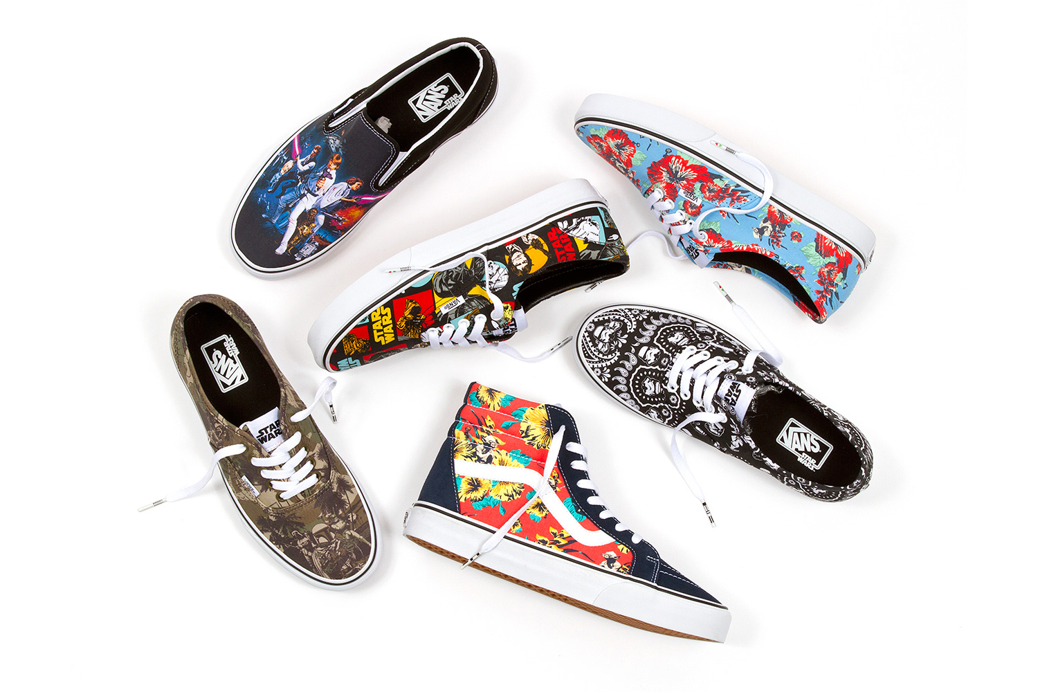
We just can’t stop smiling every time we see the Yoda Aloha print. Vans has hooked up an official license with Star Wars and they didn’t slack on the project at all. They’ve got a six-piece Classics collection featuring Boba Fett, Stormtroopers, Darth Vader, and the Death Star and another set from Vault.
Vans takes off to a galaxy far, far away for an out-of-this-world collection featuring artwork from the original Star Wars trilogy. The Force is strong in this intergalactic offering that extends from Classics and Vault by Vans footwear to men’s apparel and women’s accessories. By combining heritage Vans prints with iconic Star Wars characters, both entities present a truly unique capsule this universe has never seen before.
The Vans x Star Wars Classics and Apparel collection hit Vans retail stores and other select locations in June. For the official word from Vans and photos of nearly everything in the Classics and Vault collections, follow the jump. [click to continue…]
{ Comments on this entry are closed }
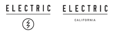
Remember that Electric “lightning-bolt-in-a-circle” logo that was causing so much grief like yesterday? The one that looked surprisingly similar to a logo found in secret Ku Kluz Klan documents? Well, it’s been purged from the Electric website entirely (see the before and after above). Gone. Now the site’s header simply says Electric California, just like their URL. Fast work on the part of Kering’s action sports accessory brand. And likely the right thing to do considering the backlash.
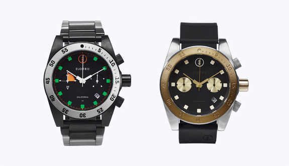
Meanwhile, check out hese fabulous new watches? The Electric Dive 02 is a dressy, sporty, fashionable watch that still has the lightning bolt logo on it’s face. Can’t change everything overnight right? Click the link for more on the watches.
[Link: Electric California]
{ Comments on this entry are closed }
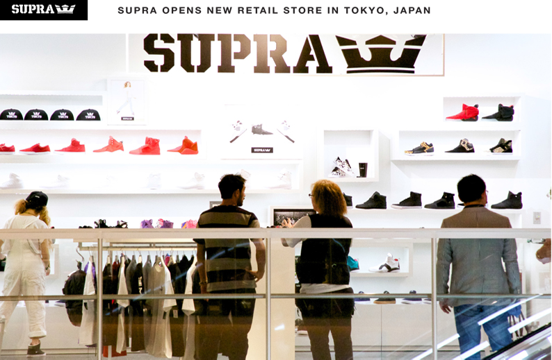
Things will happen while they can and Supra has launched their first Tokyo retail store (featuring a rooftop skatepark with a view). It’s easy when you’re big in Japan
Located in the bustling Diver City shopping plaza in Odaiba, SUPRA Tokyo is a bright, wide open space reflecting the Southern California aesthetic of SUPRA’s birthplace. The new store offers a full selection of footwear and apparel for men, women, and children with the addition of special releases exclusive to Tokyo. “After overwhelming support of the SUPRA Tokyo Pop Up store in Shibuya, we wanted to offer all of the loyal clients a permanent shopping destination,” said Angel Cabada, SUPRA co-founder.
The new store is loved at Diver City Tokyo Plaza, 1-1-10 Aomi Koto-ku, in Tokyo. Follow the jump for the official word from Supra. [click to continue…]
{ Comments on this entry are closed }
In a post on the Electric Facebook page company CEO Eric Crane said the following to what appears to be employees of the company:
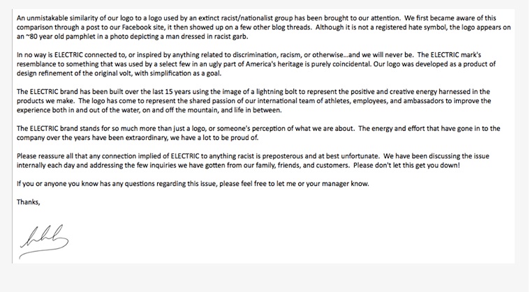
An unmistakable similarity of our logo to a logo used by an extinct racist/nationalist group has been brought to our attention. We first becme aware of this comparison through a post to our Facebook site, it then showed up on a few other blog threads. Although it is not a registered hate symbol, the logo appears on an 80 year old pamphlet in a photo depicting a man dressed in racist garb.
In no way is ELECTRIC connected to, or inspired by anything related to discrimination, racism, or otherwise . . . and we will never be. The ELECTRIC mark’s resemblance to something that was used by a select few in an ugly part of America’s heritage is purely coincidental. Our logo was developed as a product of design refinement of the original volt, with simplification as the goal.
The ELECTRIC brand has been built over the last 15 years using the image of a lightning bolt to represent the positive and creative energy harnessed in the products we make. The logo has come to represent the shared passion of our international team of athletes, employees, and ambassadors to improve the experience both in and out of the water, on and off the mountain, and life in between.
The ELECTRIC brand stands for so much more than just a logo, or someone’s perception of what we are about. The energy and effort that have gone in to the company over the years have been extraordinary, we have a lot to be proud of.
Please reassure all that any connection implied of ELECTRIC to anything racists is preposterous and at best unfortunate. We have been discussing the issue internally each day and addressing the few inquiries we have gotten from our family, friends, and customers. Please don’t let this get you down!
If you or anyone you know has any questions regarding this issue, please feel free to let me or your manager know.
And yes, it all sounds reasonable though unfortunate.
[Link: Electric Facebook]
{ Comments on this entry are closed }
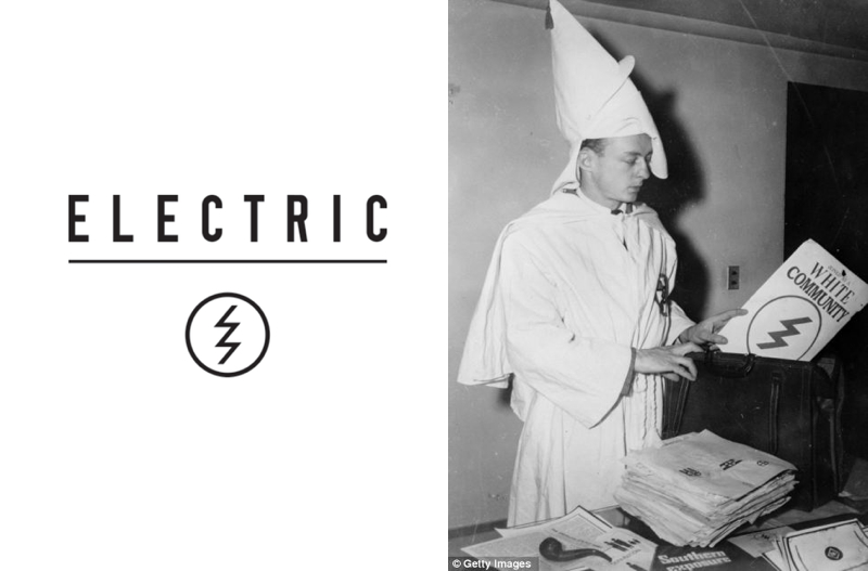
Several readers have pointed out that the Electric logo (on the above left) looks very similar to a graphic seen in some 1940s Ku Klux Klan literature (above right). And if you look closely at the image on the right, you’ll notice that they do have a valid point. The logo on the cover of White Community is absolutely identical to Electric’s double lightning bolt in a circle logo. We’re guessing no one will say this was purposeful or a logo lift at all, but it seems an odd coincidence, doesn’t it? Then again, Electric’s been doing lightning bolts in circles for years.
For the complete story on the man in the photo (Klan Buster Stetson Kennedy), click here.
[Link: Agnarchy]
{ Comments on this entry are closed }
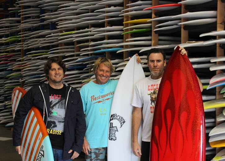
Lost’s Mike Reola, Dave Lester, and Matt Biolos in front of a quiver to die for.
Lost Surfboards‘ Matt Biolos and Mike Reola have named former Quiksilver VP Global Wetsuit Division Dave Lester (above middle) as the General manager of Lost Surfboards.
“Dave will be overseeing all aspects of our surfboard business with his major focus being on sales, shop relationships, production, operations and marketing,” said Reola.
. . “Dave has so much experience in the business and is such a core surfer. His skill set, relationships and experiences are just what we were looking for in a General Manager,” said Biolos. “He is going to help us organize and streamline our surfboard business so that it runs more efficiently.”
It’s always nice to see people leave the fashion industry and get back to surfing. . . For the official word from Lost, follow the jump. [click to continue…]
{ Comments on this entry are closed }
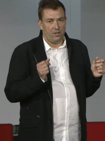 You may remember Laurent Potdevin. A while ago he was the President of Burton Snowboards. He did that job for five years then went on to be the CEO of Toms Shoes. Most recently, Mr. Potdevin was named CEO of Lululemon (the yoga pants company started by Westbeach founder Chip Wilson). Things at the suburban mom shaping factory haven’t been going that well for Mr. Potdevin and some investors feel that has to do with Laurent’s pot belly, according to a story in the NY Post.
Meanwhile, some investors who attended the meeting said they were surprised to see that Potdevin, in his first major public appearance since he took the helm in January, didn’t exactly look the part of a fitness mogul. . . “He was kind of … dumpy,” one shareholder said, noting that Potdevin wore baggy clothes with an untucked shirt that failed to hide a bulging stomach . . “If he’s a competent leader, he’s a competent leader,” another investor said. “But you’ve got to ask whether this guy is really in touch with the mind-set of his core customer in the athletic space.”
Make a presentation on a bad day and the stock falls five percent. Being the CEO of a publicly traded company must be really fun.
[Link: NY Post]
{ Comments on this entry are closed }
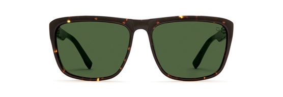
Former longboard surfing world champion and Jiu Jitsu US national champion Joel Tudor has a new shade from Spy. It’s called the Neptune and it comes in four different frame options and three different lenses.
The Neptune is Joel Tudor’s signature style, and draws a cool line between modern and classic.
What more do you need to know?
[Link: Spy Optic]
{ Comments on this entry are closed }
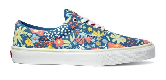
Vans is putting out some new Vans Pro Classic styles. This one above is Daniel Lutheran’s own perspective on the Era Pro. His color way features “textured floral print.”
The PRO CLASSICS™ concept is simple: enhance the functional performance of our most tried and true, heritage shoes to meet the demanding requirements of the Vans pro skate team. The spring offering includes the Era Pro, Half Cab Pro® and Slip-On Pro with upgraded features like our Ultracush HD high impact sock liners, Duracap® rubber underlays for reinforcement in high wear areas.
To see what Ray Barbee has up his musical sleeves, follow the jump for his update to the classic Old Skool ’92 Pro. [click to continue…]
{ Comments on this entry are closed }
![]()
![]()
![]()
![]()